Monday, November 29, 2010

Everything I learned in Design 1 summed up by one post:

Design is Dangerous

Designers don't always design for good. Cigarettes and their often deceitful advertisements are harmful to humans and to society. Many people become smokers because of ad campaigns by tobacco companies, which are created by designers.

Cigarettes are known to cause lung cancer, asthma, heart attacks, stroke, and many more complications that I won't elaborate on as this is a design blog, not a medical blog. My design 1 class got to experience the damage a loved one's smoking can cause when guest lecturer, Brian Fies, shared excerpts of his graphic novel, Mom's Cancer, with us. Fies's family had to watch their mother suffer and the stress and confusion took a toll on the rest of the family as well. The effects of cigarettes are dangerous and often deadly and for a designer to promote tobacco use is dangerous.


Tobacco companies have a great deal of money and power and are therefore able to pay designers well for their ad campaigns. However, is it ethical for a designer to promote something known to cause harm to humans and society? Designing promotional materials for cigarette companies is dangerous because the advertisements often target you people by appearing cool, artsy, or counter-culture. Tobacco companies have found that if they get consumers hooked on their product at a young age—often before the legal smoking age—they will be customers for life. By designing an advertisement with cartoons, which appeal to children, promoting cigarettes, the designer begins the cycle of attracting a child to cigarettes, who later becomes a smoker for life and dies prematurely of heart complications or lung cancer. Design can be very very dangerous.

In today's society, designers know the consequences of smoking and more importantly encouraging society to damage their bodies through smoking. Whether or not they choose to create dangerous design that promotes cigarettes is a question of ethics. A designer must decide if they are willing to knowingly promote a harmful substance just to get paid. The consequences of designing for tobacco companies is intentional.

Word Count: 338

Sunday, November 28, 2010

Utopian Design

Street signs are an example of a utopian design because their aim is to improve society by preventing people from getting lost and aiding in travel.The word Utopia literally means "no place," because no place on Earth can be truly perfect. However, the goal of Utopian design is to bring life on Earth as close to the unattainable ideal as possible. Designers seek to create Utopia by designing to improve society.
image via businesspartnernyc.com
Street signs benefit society by giving people a sense of direction and location. Street signs assign a name and exact coordinates to a point in space. By naming roads, one knows where they are, where they are traveling and can more easily find how to get to their destination. The best street signs are clean and easily readable. A successful sign is simple, not over-embellished, and relays its message as efficiently as possible. Making an area easier to navigate encourages travelers, which bring business and new ideas.

Since Utopia is in ideal concept, no design can truly be Utopian; however, that does not mean that designers don't continually try to achieve Utopia. Even the best designs have their shortcomings. Not all road sign are especially readable or instantly apparent to the viewer. For example, in many European countries, the street names are posted on the sides of buildings, which American travelers are unfamiliar with and often find confusing. This lack of universality causes confusion and is ultimately a downfall of this design. Also, although street signs tell you where you are, they don't always tell you how to get where you want to go and even in a well-singed city, one could end up lost.

Overall, street signs are successful at improving society and are therefore a Utopian design. Without them, navigation would be difficult, which would make travel frustrating.

Word Count: 303

how color transforms a single design


As I have been learning from Design 1 lectures and from reading Interaction of Color by Josef Albers, color can have dramatic effects on a design. The addition of color to a black and white design can be transformative. Each color carries its own distinct personality which it reflects upon the design. When presented in different colors, the same design can look dramatically different.

American painter, Wayne Theibaud, is fascinated by artificial colors and the prevalence of these colors in our society. His works carefully study the colors of mass produced objects such as cakes, candy, ice cream, and make up.
Confections by Wayne Theibaud
Theibaud's paintings are never monochromatic, but are the synthesis of several bright, eye catching colors. However, while any of these colors alone in a composition would draw the viewers attention immediately, these colors combined balance each other out and create a unified whole. The colors in Thiebaud's paintings interact rather than compete.

Albers discusses how some colors are more dominant than others. Thiebaud uses this dominance effect to his advantage when intending a bright color or colors to stand out from a subdued background.
Boston Cremes by Wayne Thiebaud
Thiebaud's painting are often characterized by dramatic shadows. To convey these shadows, Thiebaud mixes the bright colors used in the lit surface with darker colors like black to create varying shades of the colors, which illustrate varying degrees of shadow.

If one were to subtract color from Theibaud's paintings, while they would still by lovely, they would not be nearly as captivating. Color transforms his designs and urges the viewer to look at the brilliant artificially-produced colors that exist in everyday objects.

Word Count: 268

Monday, November 15, 2010

Ergonomics

At the surface level, industrial design appears to be mostly consumed with aesthetics. Admittedly, some designs are; McCloud compares these designs with all aesthetics and no substance to a hollow apple. However, the major concern of industrial designers is ergonomics, or how to make a product work better for the consumer on a variety of levels.


I have chosen to analyze a riding helmet from a point of ergonomic criticism. My riding helmet has saved my life—or at least prevented serious head trauma—on several occasions. Specifically I am analyzing a GPA brand helmet that I currently wear when riding.

image via yourhorse.co.uk

The most essential level of ergonomics research is safety. If a product is unsafe, it can’t be sold or produced, no matter how beautiful, comfortable, or useful it is. A riding helmet’s primary function is safety. In the event of a fall, it protects the wearers head. It also prevents head injuries from low branches while riding on a trail. The durable construction made from packed foam and titanium allow for optimal safety. The protective materials are cushioned by foam and velvet, so as not to cut or irritate the riders head while wearing. Another notable safety feature is the adjustable chin strap, which custom fits to the riders head to be as effective as possible at keeping the rider safe. I can personally testify that this riding helmet has kept me safe several times. Therefore, it accomplishes its goal of safety.


Although durable, the helmet is also lightweight, which allows it to be comfortably worn even over the course of a long ride. The thick inner padding also allows for maximum comfort while also preventing the helmet from uncomfortably shifting around the wearers head. One especially uncomfortable feature about riding helmets is that they can tend to make the wearers head unpleasantly hot and sweaty. One comfort related feature I appreciate about this particular helmet is the cooling vents at the top and sides, so that air can flow through as one rides.


Generally speaking, a helmet is a fairly easy, self-explanatory object to use. The one aspect that can cause difficulty of use is adjusting the straps to fit ones head perfectly. Helmets I’ve worn in the past have had several different straps that often got tangled around each other and could easily become too tight or too loose. This helmet resolves those issues by combining the multiple straps in to one easily adjusted strap.


This helmet performs well by achieving its primary purpose—to prevent the wearers head from getting injured. I’ve had this helmet for several years and it continually works. Longevity is an important characteristic of a product. As mentioned in Objectified, objects should be designed to last, not to be disposed of. Despite accompanying me through many falls and close encounters with tree branches, I still trust this helmet to keep me safe.


The final level of ergonomic research is aesthetics. As helmets are a key part of the english rider’s show uniform, they are designed to look nice. Typically, all show helmets are made from velvet. This one features soft black velvet that despite being several years old has not faded or worn significantly. However, there are a few patches where it has been dropped that have caused the velvet to wear. In interest of improving the aesthetics of this object, one may want to design a way for the velvet exterior to be more durable and less likely to wear or show dirt. Another significant aesthetic feature is the titanium strip down the center. Not only does it offer the helmet a modern. streamlined look, but also serves to offer added protection and serve as a location for the aforementioned cooling vents.


Overall, this helmet is a well-designed object from an ergonomic perspective.


word count: 622

Democratic Design

In the film Objectified, one of the designers asserts that "in the future, the tools to make design will be available to everybody." I believe that future is now.
image via spic.com
One would be hard pressed to find a modern American household—or a household any modernized country—that did not own at least one computer. Many households even have one computer per family member. Today's youth have grown up with computers and the internet their entire lives. Many of these computer users have access to photoshop or similar editing and/or design programs. Many of these photoshop users obtained their software from less than legal means, but ethics in design should be saved for another blog post entirely.

With the increased availability of computers and design software, design tools are becoming increasingly available to a wider audience. Also, the internet allows the user to have access to a wider variety of designs and designers then ever before. When browsing the internet, one is often bombarded with images—some well designed, and other poorly designed—and it can often be overwhelming.

Although design tools aren't available to literally every person on the planet, we as a culture are nearing the day when everyone is a designer. That is not to say that everyone is a necessarily refined or creative designer, but they possess the tools and the knowledge nonetheless. A surprising number of children under 15 know how to doctor photos. I could not find any official statistics on the matter, but in my own experience, I have been continually surprised at the number of children who can edit and manipulate photographs. In high school, this was an envied skill, as hordes of insecure girls rushed to the computer lab to mask their insecurities through photoshop.

I believe that for better or for worse, the era of design tools being readily available to everybody is upon us. Although it may increase competition for design jobs, the benefits of having so many fresh minds in the design realm will likely outweigh any costs.

word count: 340

Sunday, November 7, 2010

Visual Culture of our Times

This weekend I was able to visit SFMOMA for the first time. The experience was magical. Among all the rooms filled with works of art from the likes of Picasso, Mondrian, Magritte, and Lichenstein, I found myself most inspired by the room dedicated to graphic and industrial design.
As I entered the room, "SFMOMA has long considered industrial and graphic design, however quotidian or commercial, to be central to the visual culture of our times." was emblazoned on the wall. As someone pursuing a career in design, this especially resonated with me. Design plays a special role in both art and popular culture. Through graphic and industrial design, the designer essentially creates a time capsule of the period they are designing in. By looking back at graphic and industrial designs from eras past, we can get the most accurate idea of their life and mindset. Mass-produced everyday objects provide an insight in to the life of the owners that priceless, one-of-a-kind objects cannot. Similarly, these mass-produced objects give a better picture of a society as a whole, while handmade—which implies expensive—objects are almost always reserved for the wealthy upper-class exclusively and only gives the observer a look at a small demographic rather than the majority.

At the SFMOMA Excellent design is held in the same reverence as fine art. The mass-produced posters and industrial objects are hung with respect on the museum's walls. It was inspirational to see that good design—however commonplace—being acknowledged and immortalized.
Olivetti Typewriters are an incredible example of industrial design as well as the evolution and perfection of it. Each typewriter was displayed with a corresponding poster used to advertise the typewriter. These typewriters are an excellent example of both practical function and aesthetics. The posters' ability to mirror the aesthetics of the typewriter as well as appeal to the appropriate target audience is of a level that modern designers still aspire to.

The "Designing a Modern Brand" exhibit at the SFMOMA—although small in contrast to some of the other exhibitions, had a dramatic and inspiring effect on me and served to remind me why I love design so exponentially.

Friday, November 5, 2010

Words as Images

Much of design deals with the synthesis and juxtaposition of words and images; however, sometimes words and images can be one in the same.

Through the study of typography, the designer learns how different letterforms can embody different personalities and moods. However, in some instances, the designer pushes that subtle characterization to the extreme to the point where words resemble images, yet still retain their recognizable shapes.

Words as images is playful and attracts the audience's attention. It instantly attracts attention, because people see it as clever and as a break from the normal separation of type and images. Even in media like comics where type and images are combined, they are often separated by space or a speech bubble and are rarely part of the same form.
These are typically bistable images. Gestalt psychology tells us that we can't seen both the word and the image at the same time. This phenomenon adds interest to the design and causes the viewer to want to stare longer, which makes it very effective as a communication tool.

One disadvantage to using words as images is that readability is often sacrificed. It takes longer for the viewer to comprehend both the word and the image, which makes this technique absolutely impractical for things like highway signage. Also, when used in excess, it loses its novelty and can become obnoxious. Therefore when used in poster design is often juxtaposed with a clean readable type.

Playing with type and creating images from type can be a very useful design tool. What it lacks in readability, it makes up for in visual interest. Type working as image is the ultimate marriage of word and image

Images and words in graphic novel

Recently, my design 1 class had the privilege of meeting Brian Fies, an accomplished graphic novelist. Author of Mom's Cancer and Whatever Happened To The World of Tomorrow. Brian Fies was a fascinating speaker. He was surprisingly humble and self-depricating. He also seemed genuinely interested in offering us whatever advice he could to further our careers. Fies was kind enough to show us several pages from his novels and discuss

As McCloud describes in Understanding Comics, there are several ways of dealing with the interaction of words and images in the comic or graphic novel setting. Fries showed us a variety of methods he implemented in his graphic novels.
page from Mom's Cancer by Brian Fies
Although the main character of the novel appears to be Fies's mother, Mom's Cancer often reads like an autobiography. Therefore, much of the text is an internal monologue, that may not relate directly to what is pictured, but nonetheless enhances the story. Fies's narrative also adds a personal emotional element to the story that introduces another dimension to the story. McCloud defines this as additive combination of words and images, where words amplify or elaborate on an image or vice versa.

page from Mom's Cancer by Brian Fies
One page from Brian Fies's lecture particularly stood out to me: the page depicting his mother deep in a drug-induced sleep, while going through the hours of chemotherapy. Many medical items as well as personal articles surrounded her chair. As an image alone, the reader sees his mother in the chair and is able to grasp the basic situation. The reader sees this image as a unified whole—or gestalt—not as individual parts. However, with the addition of words, each object in the image is identified. This serves to add a personal, emotional level to the compostion: the reader is no longer looking at an ill woman, but a woman who adventured through Alaska, likes to play slot machine games, and has a partiality to strawberry milkshakes. The reader is reminded, that this woman is neither nameless or faceless, but the author's mother.

Monday, November 1, 2010

Music and Visual Communication

Professor Housefield continually revisits the theme of music and design, specifically the interaction and conversation between the two. Some examples from class include Lady Gaga and Yoko Oko's performance as an example of conversation through design and Cab Calloway's music paired with Betty Boop cartoons. Since music is a purely aural function, it relies on visual communication to stimulate the listeners visual senses. Artists accomplish this through music videos, album covers, and stage design at live performances.
Lady Gaga's "Monster Ball" photo via hauteandthecity.com
Both design and music are very emotional practices and the combination of them is even more powerful for the audience. The goal of any performer is to give the audience the best, most enjoyable experience they can. One of the most effective ways to do this is through stage/concert design. Artists like Lady Gaga spend nearly all of the money earned from their concert on elaborate set designs to transport the audience to another universe for a few hours.
Runaway Nurse by Richard Prince
At Paul McCartney's Los Angeles Performance this year, he accompanied his famous tune, "Paperback Writer," with images of Richard Prince's nurse paintings, which are based on the covers for pulp fiction paperbacks. The vibrant colors of Prince's paintings and the sexually-charged subject matter enhanced McCartney's energetic performance. The macabre tone of the paintings juxtaposed the upbeat feel of "Paperback Writer." The overall effect was one of excitement and chaos.

The marriage of visual communication and music has been around for as long as the two art forms have existed, but their relationship is constantly evolving with changing technology.

I Scream For Mass Production!


Of all the information from the film Objectified, something industrial designer, Marc Newson, mentioned resonated strongly with me. Newson stated, "Ultimately our job as a designer is to look in to the future." By this he meant that designers should create products that the user wants to keep and that will last a life time. He emphasized implementing non-disposable products instead of disposing products made with permanent materials. Objectified exposed the darker side of industrial design—once new products were quickly becoming obsolete and ending up in landfills. A common goal of the designers in the film was to produce sustainable and environmentally-friendly products.

One object that most likely everyone in the modern world has encountered at least once in their daily lives. It is simple, requires little to no packaging, and leaves no trace of its existence once its through being used. The object I chose to analyze is an ice cream cone!
image via somethingunexpected.tumblr.com
The ice cream cone has been in use since the 1800s. They were initially hand-rolled until 1912, when a machine was invented to make them and they became a mass produced object. The most notable characteristic of an ice cream cone is its form—that of a hollow cone. This allows the ice cream to remain inside the pastry, while the user can hold the cone without getting their fingers sticky. Also notable is the texture of the cone. It's distinct "waffle" texture not only adds visual appeal, but also assists the consumer in gripping the cone to prevent them from dropping it. it's color—typically a golden brown—is inviting and pleasant. Although it's not technically a design term, the cone's smell is also delicious.

The ice cream cone's most useful features include its portability and thickness. The cone can go virtually anywhere, which makes it easily enjoyed by consumers enjoying a walk through the park or playing at the beach. The hands-free eating is also a convenience. Another notable design feature is the thickness of the cone material. It is just thin enough to be lightweight and easy to bite through, yet just thick enough to prevent the ice cream from seeping through the pastry. Most notably, the ice cream cone eliminates the need for dishes and silverware, which require energy to wash, or paper cups and plastic spoons, which ultimately end up in landfills. Although many people don't realize it, the ice cream cone is extremely environmentally friendly.

Ice cream cones are one of many examples of the incredible amount of design that goes in to everyday objects.

Objectified: Form and Content

The film Objectified emphasizes the idea that form follows content. Throughout the documentary, the designers illustrated how form is derived from content.
evolution of vegetable peeler design. Photo: nytimes.com
For example, we witnessed a design begin as an idea—that toothbrushes should be more environmentally friendly. From there it evolved through collaboration in to several unified ideas and the content began to formulate itself as a wall covered in post-it notes. The task of the designer is to derive from that content the form that would best embody the original idea. Therefore, design becomes a search for form. This search was documented through Objectified.
Another notable example of the relationship between form and content is that of Smart Design's design process. Their philosophy is to put great design in to everyday objects. They approach their designs by identifying what is wrong with existing objects—flaws that people overlook and often accept as unchangeable. From the existing problems, they draw their content and the form is the solution to the problem. In the film, the designers discussed how traditional potato peelers would hurt the users hand since the handle was uncomfortable. From this problem, they drew their content—they would design a potato peeler that was comfortable and easy to use. From there, they worked to design the appropriate form, trying many different types of handles before they found a perfect fit.

The movie itself exemplified the philosophy that form should be determined by content. Most obvious is the fact that the filmmakers chose to present this content in a film format, most likely because it would best represent the visual nature of the objects discussed. Also, while the designers were being interviewed, the camera would focus mostly on inanimate objects rather than the designers faces. Sometimes it showed the objects being built or designed, sometimes the finished product, and sometimes it even showed objects within the particular designer's studio. While the designers spoke—and thus provided the content—the visual aspect of the film focused on the form.

Monday, October 18, 2010

Logo Redesign: Compare and Contrast


Logo redesign means big changes for a company. When a logo changes everything changes. A logo redesign is often accompanied by a thorough rebranding, new target markets, extensive PR and promotional work, internal company changes, as well as a renewed public interest. People tend to really notice a logo when something is off or different about it. For example, many people never payed much attention to the relatively uninteresting blue square Gap logo until it was replaced by the took-two-minutes-in-Microsoft-Word monstrosity. However, theres nothing I can say about the Gap logo change and change back that hasn't already been said by thousands of other design bloggers out there. Instead I've decided to write about what makes a logo redesign successful by comparing and contrasting new and old logos.

The Conservation International logo recently underwent a major redesign. Conservation International is an organization partners with major brands to advocate for sustainability, care for nature, and global well-being.
logos property of Conservation International
Their old logo—quite literally—a jungle of confusion with too many elements to be memorable. Their new logo embodies simplicity and gives a feeling of clean air and open space. The blue circle represents the planet, which is far more conceptual than their old version which was much more literal. The type is much cleaner as well (Gotham is almost always a great solution). The new redesign rid the logo of the boxy 80s feel. The old logo is complicated and looks like it would not reproduce well on a small scale—for example on a letterhead or business card. Both logos and emphasize the word conservation, which is a smart element to keep, because that is the main goal of the company. Personally, I greatly prefer the newer logo and feel that it is a great example of a successful logo redesign.

Design Unexpected

photo: designworklife.com
Many of my classmates mentioned that legos were what first inspired them to start designing and start thinking critically about design. However, when most people approach a set of legos they focus only on their intended use: to build and create by attaching the colored bricks to one another. This use is in no way limiting and opens up the designer to infinite possibilities.

photo: designworklife.com
When this toy is used in an unconventional way, the results can be surprising. The talented artists of Physical Fiction developed a lego letterpress. They used the iconic raised circles and squares of the lego bricks as a pixel-like element to create exciting and unusual prints. Lego and letterpress were clearly a match made in design heaven.
photo: designworklife.com
Designers must always remember to look at a project in an unexpected way and the results can often be extraordinary. Designing unexpectedly often requires taking risks—these risks don't always end in success. Designing unexpectedly also requires the designer to spend more time imagining, planning, and conceptualizing. For these reasons, designers often choose to go with safer designs that they already know will work. Just like the lego example, these conventional designs can often be brilliant; however, when one considers an unexpected use for everyday tools, the result can be extraordinary.

Sunday, October 17, 2010

Design as a Conversation


In Professor Housefield's blog, "Design as a Conversation," he posed the question "When does a designer's voice deliver a monologue rather than engage a conversation?" My answer is that design is never a monologue. Design is always speaking to an audience, calling out to someone, responding to someone or something, and initiating a conversation.

Design is never static. Design is never silent. Design is always speaking—sometimes it shouts and sometimes it whispers. When a design speaks, anyone who witnesses it is invited to respond. Design is a conversation. A successful design can solicit a response from anyone—a reader viewing their print ad in a magazine, a passerby stopping to notice a poster, or even a passenger (because the driver, of course, is focused on the road) racing by a billboard at sixty miles per hour.

Print design often has to anticipate the viewer's response because it cannot react to it the way interactive design can. Therefore, a designer must know their audience in order to understand the nature of the conversation they are engaging. For example, on a poster for Kawasaki I worked on in a recent internship, the conversation is started by metaphorically shouting to catch the audience's attention. The metaphoric shout is achieved by the dynamic angle of the the bike, the vibrant colors, which is followed by informing them of the rider and the bike in a manner that appeals to the target audience. As the designer I then assumed that I had caught their attention and piqued their interest and finished by quietly informing them that they could purchase this bike at Kawasaki.

Kawasaki KX450F impact board. Photographed by Douglas Henry. Designed by Douglas Henry and Sarah Smith

This design engages in conversational give-and-take by referencing hang lettering techniques in the typography. It was achieved with a bamboo pen and ink, which is a very old and widely used method. It also references the gritty, urban typographic style of punk bands and was inspired by graphics for The Adicts and The Exploited. This style is appropriate for this specific target market and therefore achieves a positive response. However, this style—or genre of conversation—would not be appropriate for a high end fashion retailer or a corporate business firm.

Just as certain conversations appeal more to certain people, certain designs appeal to certain audiences. The designer must always keep their target audience in mind when engaging in a design conversation. They want to convey the right idea to the right people.

Design is a conversation. It responds to other designs while still engaging and initiating further conversation. A design isn't created to stand alone. It is intended to invite a response.

Monday, October 11, 2010

Design Environment Affects Design

Design is present everywhere in our society. The world of design expands far beyond dresses, posters, and fancy living rooms. In this case design can even be a piece of chewing gum.

Last week in Design 1, Professor Housefield mentioned the 2010 nobel prize winning invention called graphene, which is the thinnest manmade material. The fact that it is only one atom thick is not the only thing that makes graphene unique; what is especially interesting about this substance is that it was invented during a "playday." The scientists responsible were encouraged to create freely and see what they end up with, without having a specific plan or a specific end result in mind. This creative process is similar to that which we applied to our stone soup project.
still from the 1971 film, Willy Wonka & The Chocolate Factory
Recently, I came across an article from the telegraph.co.uk that describes researchers applying a similarly creative design process to create something that before now had only been a fantasy. While attempting to develop technology that would release drugs to specific parts of the digestive system researchers created microcapsules that require different amounts of chewing and saliva to break open. They now want to use this technology to recreate the infamous three-course-meal chewing gum from Raold Dahl's classic children's book, Charlie and the Chocolate Factory, which caused the gum-loving Violet Beuregard to blow up like a giant blueberry.

The main difference between the process of developing graphene and designing flavor-changing gum is that the gum developers had a goal in mind that they were striving to reach. However, these projects are similar because they were both developed in a freely creative environment. They are both new and creative ideas born from a design environment that encourages innovative thinking.

This is an excellent example of how a positive and stimulating design environment can foster the creation of incredible ideas. Designer's design because they have to. The mind of a designer can't be switched off, it is constantly creating. This creativity should never be repressed, but instead should be encouraged. Great things can come from it—anything from a Nobel Prize worthy invention to a whimsical candy creation.

Saturday, October 9, 2010

Inspiration From Without


Great design is rarely the result of divine inspiration. Designers draw their inspiration, not only from within themselves, but the world around them.


Alexander McQueen 2008
One common source of inspiration from without is nature. Many designers turn to nature for inspiration. For example, Alexander McQueen's collections are often inspired by birds (2008), butterflies (2011), and even armadillos (2010). His nature-inspired pieces have continually amazed fashion week crowds over the past years. McQueen is able to take inspiration from everyday objects like butterfly wings or seashells and turn it in to something amazing and unexpected.
Andy Goldsworthy
Another example is Andy Goldsworthy—an artist who uses nature as his inspiration and his medium. Goldworthy often works with only found tools and materials when he creates some of his ephemeral works consisting of leaves, petals, rocks, and twigs. His creations are often inspired by the environment in which he is working. For example, his sculptures and assemblages often mimic the flow of a river or the curve or a ram's horn.

Personally I like to turn to books to find inspiration from without. As a design student, I have many things to learn about design and design history. In my designs I often like to look back to the accomplished designers before me as well as contemporary designers to be inspired by their great works. Whenever I have a case of "designer's block," I like to browse through the latest issue of Print or Communication Arts to see what about those featured designs makes them successful. In addition to looking at modern designs, I like to turn to historical art and design and often find myself inspired by great designs throughout history. For this reason, I always like to keep a "design library" wherever I am working. I even brought some of my favorite selections with me to UC Davis.

Inspiration from without is an important part of the design process. No matter how talented the designer, it is nearly impossible to create constantly without drawing upon the world around them for inspiration.

Thursday, October 7, 2010

Stone Soup


Last Tuesday in design 1, we made a project inspired by the classic children's story, Stone Soup. In the story, all of the villagers bring different ingredients to make a soup out of whatever they happen to have and ended up with a delicious feast that everyone got to enjoy. Everyone in our group of eight design students brought something to create with. We didn't plan what to make or what to bring, so our design was very spontaneous, which was exciting.

One of the biggest challenges of this project was working without a sketch. When I design, I typically like to sketch my design ideas first, to get an idea of how they will look and to explore all possible options for the project before choosing my final design. However when faced with designing in a group setting everyone had different creative processes and synthesizing them was a bit of a challenge. The majority of my group didn't like to sketch and insisted we "just go for it." I reluctantly set down my sketchpad and embarked on a chaotic journey.

Despite not having a sketch, we were still able to communicate our ideas verbally—at least for the most part. Everyone was throwing out interesting and often outlandish ideas. For every idea someone came up with, even more people were willing to offer criticisms, but fortunately everything remained friendly.

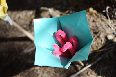
We decided to make a paper sculpture that used a tree for support instead of being freestanding. Our goal was to make the sculpture look organic—like it was part of the tree, not a bunch of craft supplies affixed to the tree. Our sculpture spiraled up the tree trunk and focused on geometric shapes and emphasized three-demensionality. The sculpture was finished by hanging paper cranes from the upper branches, which looked quite etherial.

Overall I was very impressed with the finished product. Our group collaborated well and everyone contributed ideas and worked hard to complete our project within the time limit. If I were the art director I might insist that we attempt to find a way to make the paper cone shapes without the tape showing because that would cause it to look more organic. However, our limited time and materials did not allow this to be possible.

Only moments after our design was completed, we had to tear it all down. The tree trunk was left bare and unadorned as if our paper sculpture had never been there. Today was learned what it meant for a design to be ephemeral.