Monday, October 18, 2010

Logo Redesign: Compare and Contrast


Logo redesign means big changes for a company. When a logo changes everything changes. A logo redesign is often accompanied by a thorough rebranding, new target markets, extensive PR and promotional work, internal company changes, as well as a renewed public interest. People tend to really notice a logo when something is off or different about it. For example, many people never payed much attention to the relatively uninteresting blue square Gap logo until it was replaced by the took-two-minutes-in-Microsoft-Word monstrosity. However, theres nothing I can say about the Gap logo change and change back that hasn't already been said by thousands of other design bloggers out there. Instead I've decided to write about what makes a logo redesign successful by comparing and contrasting new and old logos.

The Conservation International logo recently underwent a major redesign. Conservation International is an organization partners with major brands to advocate for sustainability, care for nature, and global well-being.
logos property of Conservation International
Their old logo—quite literally—a jungle of confusion with too many elements to be memorable. Their new logo embodies simplicity and gives a feeling of clean air and open space. The blue circle represents the planet, which is far more conceptual than their old version which was much more literal. The type is much cleaner as well (Gotham is almost always a great solution). The new redesign rid the logo of the boxy 80s feel. The old logo is complicated and looks like it would not reproduce well on a small scale—for example on a letterhead or business card. Both logos and emphasize the word conservation, which is a smart element to keep, because that is the main goal of the company. Personally, I greatly prefer the newer logo and feel that it is a great example of a successful logo redesign.

Design Unexpected

photo: designworklife.com
Many of my classmates mentioned that legos were what first inspired them to start designing and start thinking critically about design. However, when most people approach a set of legos they focus only on their intended use: to build and create by attaching the colored bricks to one another. This use is in no way limiting and opens up the designer to infinite possibilities.

photo: designworklife.com
When this toy is used in an unconventional way, the results can be surprising. The talented artists of Physical Fiction developed a lego letterpress. They used the iconic raised circles and squares of the lego bricks as a pixel-like element to create exciting and unusual prints. Lego and letterpress were clearly a match made in design heaven.
photo: designworklife.com
Designers must always remember to look at a project in an unexpected way and the results can often be extraordinary. Designing unexpectedly often requires taking risks—these risks don't always end in success. Designing unexpectedly also requires the designer to spend more time imagining, planning, and conceptualizing. For these reasons, designers often choose to go with safer designs that they already know will work. Just like the lego example, these conventional designs can often be brilliant; however, when one considers an unexpected use for everyday tools, the result can be extraordinary.

Sunday, October 17, 2010

Design as a Conversation


In Professor Housefield's blog, "Design as a Conversation," he posed the question "When does a designer's voice deliver a monologue rather than engage a conversation?" My answer is that design is never a monologue. Design is always speaking to an audience, calling out to someone, responding to someone or something, and initiating a conversation.

Design is never static. Design is never silent. Design is always speaking—sometimes it shouts and sometimes it whispers. When a design speaks, anyone who witnesses it is invited to respond. Design is a conversation. A successful design can solicit a response from anyone—a reader viewing their print ad in a magazine, a passerby stopping to notice a poster, or even a passenger (because the driver, of course, is focused on the road) racing by a billboard at sixty miles per hour.

Print design often has to anticipate the viewer's response because it cannot react to it the way interactive design can. Therefore, a designer must know their audience in order to understand the nature of the conversation they are engaging. For example, on a poster for Kawasaki I worked on in a recent internship, the conversation is started by metaphorically shouting to catch the audience's attention. The metaphoric shout is achieved by the dynamic angle of the the bike, the vibrant colors, which is followed by informing them of the rider and the bike in a manner that appeals to the target audience. As the designer I then assumed that I had caught their attention and piqued their interest and finished by quietly informing them that they could purchase this bike at Kawasaki.

Kawasaki KX450F impact board. Photographed by Douglas Henry. Designed by Douglas Henry and Sarah Smith

This design engages in conversational give-and-take by referencing hang lettering techniques in the typography. It was achieved with a bamboo pen and ink, which is a very old and widely used method. It also references the gritty, urban typographic style of punk bands and was inspired by graphics for The Adicts and The Exploited. This style is appropriate for this specific target market and therefore achieves a positive response. However, this style—or genre of conversation—would not be appropriate for a high end fashion retailer or a corporate business firm.

Just as certain conversations appeal more to certain people, certain designs appeal to certain audiences. The designer must always keep their target audience in mind when engaging in a design conversation. They want to convey the right idea to the right people.

Design is a conversation. It responds to other designs while still engaging and initiating further conversation. A design isn't created to stand alone. It is intended to invite a response.

Monday, October 11, 2010

Design Environment Affects Design

Design is present everywhere in our society. The world of design expands far beyond dresses, posters, and fancy living rooms. In this case design can even be a piece of chewing gum.

Last week in Design 1, Professor Housefield mentioned the 2010 nobel prize winning invention called graphene, which is the thinnest manmade material. The fact that it is only one atom thick is not the only thing that makes graphene unique; what is especially interesting about this substance is that it was invented during a "playday." The scientists responsible were encouraged to create freely and see what they end up with, without having a specific plan or a specific end result in mind. This creative process is similar to that which we applied to our stone soup project.
still from the 1971 film, Willy Wonka & The Chocolate Factory
Recently, I came across an article from the telegraph.co.uk that describes researchers applying a similarly creative design process to create something that before now had only been a fantasy. While attempting to develop technology that would release drugs to specific parts of the digestive system researchers created microcapsules that require different amounts of chewing and saliva to break open. They now want to use this technology to recreate the infamous three-course-meal chewing gum from Raold Dahl's classic children's book, Charlie and the Chocolate Factory, which caused the gum-loving Violet Beuregard to blow up like a giant blueberry.

The main difference between the process of developing graphene and designing flavor-changing gum is that the gum developers had a goal in mind that they were striving to reach. However, these projects are similar because they were both developed in a freely creative environment. They are both new and creative ideas born from a design environment that encourages innovative thinking.

This is an excellent example of how a positive and stimulating design environment can foster the creation of incredible ideas. Designer's design because they have to. The mind of a designer can't be switched off, it is constantly creating. This creativity should never be repressed, but instead should be encouraged. Great things can come from it—anything from a Nobel Prize worthy invention to a whimsical candy creation.

Saturday, October 9, 2010

Inspiration From Without


Great design is rarely the result of divine inspiration. Designers draw their inspiration, not only from within themselves, but the world around them.


Alexander McQueen 2008
One common source of inspiration from without is nature. Many designers turn to nature for inspiration. For example, Alexander McQueen's collections are often inspired by birds (2008), butterflies (2011), and even armadillos (2010). His nature-inspired pieces have continually amazed fashion week crowds over the past years. McQueen is able to take inspiration from everyday objects like butterfly wings or seashells and turn it in to something amazing and unexpected.
Andy Goldsworthy
Another example is Andy Goldsworthy—an artist who uses nature as his inspiration and his medium. Goldworthy often works with only found tools and materials when he creates some of his ephemeral works consisting of leaves, petals, rocks, and twigs. His creations are often inspired by the environment in which he is working. For example, his sculptures and assemblages often mimic the flow of a river or the curve or a ram's horn.

Personally I like to turn to books to find inspiration from without. As a design student, I have many things to learn about design and design history. In my designs I often like to look back to the accomplished designers before me as well as contemporary designers to be inspired by their great works. Whenever I have a case of "designer's block," I like to browse through the latest issue of Print or Communication Arts to see what about those featured designs makes them successful. In addition to looking at modern designs, I like to turn to historical art and design and often find myself inspired by great designs throughout history. For this reason, I always like to keep a "design library" wherever I am working. I even brought some of my favorite selections with me to UC Davis.

Inspiration from without is an important part of the design process. No matter how talented the designer, it is nearly impossible to create constantly without drawing upon the world around them for inspiration.

Thursday, October 7, 2010

Stone Soup


Last Tuesday in design 1, we made a project inspired by the classic children's story, Stone Soup. In the story, all of the villagers bring different ingredients to make a soup out of whatever they happen to have and ended up with a delicious feast that everyone got to enjoy. Everyone in our group of eight design students brought something to create with. We didn't plan what to make or what to bring, so our design was very spontaneous, which was exciting.

One of the biggest challenges of this project was working without a sketch. When I design, I typically like to sketch my design ideas first, to get an idea of how they will look and to explore all possible options for the project before choosing my final design. However when faced with designing in a group setting everyone had different creative processes and synthesizing them was a bit of a challenge. The majority of my group didn't like to sketch and insisted we "just go for it." I reluctantly set down my sketchpad and embarked on a chaotic journey.

Despite not having a sketch, we were still able to communicate our ideas verbally—at least for the most part. Everyone was throwing out interesting and often outlandish ideas. For every idea someone came up with, even more people were willing to offer criticisms, but fortunately everything remained friendly.

We decided to make a paper sculpture that used a tree for support instead of being freestanding. Our goal was to make the sculpture look organic—like it was part of the tree, not a bunch of craft supplies affixed to the tree. Our sculpture spiraled up the tree trunk and focused on geometric shapes and emphasized three-demensionality. The sculpture was finished by hanging paper cranes from the upper branches, which looked quite etherial.

Overall I was very impressed with the finished product. Our group collaborated well and everyone contributed ideas and worked hard to complete our project within the time limit. If I were the art director I might insist that we attempt to find a way to make the paper cone shapes without the tape showing because that would cause it to look more organic. However, our limited time and materials did not allow this to be possible.

Only moments after our design was completed, we had to tear it all down. The tree trunk was left bare and unadorned as if our paper sculpture had never been there. Today was learned what it meant for a design to be ephemeral.

Monday, October 4, 2010

The Universal Language of Design


On the first day of Design 1, Professor Housefield spoke briefly about design having its own languages. This especially resonated with me, because it caused me to think about how the language of design transcends any spoken language in to something that is universally understood.

One of the most prominent examples in my mind of the language of design is that of symbols. Many ancient cultures, such as the Egyptians, used symbols (or hieroglyphs, as they called them) as their primary form of writing, Some languages, such as Chinese, still use these symbols to write rather than an alphabet system like most other cultures have adopted. One of the major drawbacks of an alphabet system is that the reader must understand the language it is written in to understand what the writer is trying to convey. However, no matter what country one visits, they know whether they're supposed to go through the door with the stick figure wearing the dress or the stick figure wearing pants. This is an example of effective communication through symbols.

Every day we encounter hundreds of symbols in our daily life. Many people are so accustomed to seeing them that they don't realize how often they are exposed to design's universal language. We are so accustomed to them that we don't take the time to think about them—which is exactly what the designers were after: instant and clear understanding.

Simple concepts such as male, female, food, car, or airport are fairly easily illustrated, especially since widely understood symbols are all ready in place for these concepts. However more abstract concepts are often hard to illustrate with a single symbol. This offers a unique problem to the designer. One possible solution is to use multiple symbols, but that allows for more potential misreadings and can get overly complicated very quickly. Usually the best solution is to invent a new symbol that can be readily understood by a multitude of cultures, yet is simple and easily readable at any scale. Obviously this is no easy task. However, designers have been undertaking these challenges for centuries and now is absolutely no time to stop.

As the world becomes increasingly connected, thanks to internet, availability of travel, and other new technologies, our world also become more and more reliant on symbols. Every day our culture moves to become more and more symbol-oriented. New symbols are constantly forming while existing ones continue to evolve. Fortunately that means that designers will continually be kept busy.

Greyfriars Bobby: A Tale of Design Discovery

Nearly every summer of my childhood my family and I travelled to Scotland to visit my grandparents. The whole experience seemed magical to me and certainly made a great impression on me. Packing up clothes and toys and leaving for the airport, only to be transported up in to the sky high above my hometown in to a mysterious cloudy heaven and then hours later landing in a new country

Everything about Scotland was dramatically different from what I was accustomed to. Everything seemed to have an air of magic and mystery. One object in particular stood out to me more than anything else. It was a statue of a small black dog known as Greyfriars Bobby. He sat proudly in the middle of a busy Edinburgh street.

My father had told me stories about the lovable little terrier that guarded his masters grave in Greyfriars Kirk for fourteen years until the dog was buried next to his master. Upon seeing the statue, I instantly recognized the likeness.

I was instantly drawn to the statue because of the cute terrier perched atop it. Many of the statues and sculptures I had seen were very tall and foreboding and often referenced historical events I had never heard of; however, this particular statue felt so much more accessible.
photo via edinphoto.org.uk
What caused me to see the statue as a design object were the two water fountains attached to the statue's base—a higher one for humans and a lower one for dogs. The concept of a dog-sized drinking fountain as part of the statue honoring the loyal terrier struck me as remarkable and caused me to consider who would come up with such a clever idea. I appreciated the multi-functionality of this design—not only was it a aesthetically pleasing art object that improved the look of the city, but also functioned as a water fountain for both humans and dogs, and served to commemorate Bobby's loyalty. This was one of my first memories of thinking critically about design and realizing design's impact on society.
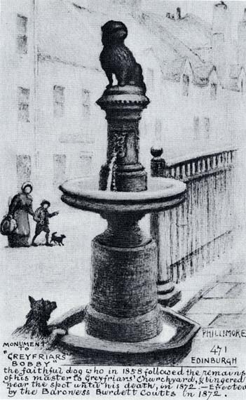
This little statue exemplified for me how a single object could convey a wealth of emotions and information and despite being on public display, seemed to speak just to me.

Sunday, October 3, 2010

First Impressions


As this is my first blog, it seemed like an appropriate time to write about first impressions. After all, one of the major concerns of design is first impression.

image via flicker.com/333bracket

"Don't judge a book by its cover" is a noble sentiment, but almost no one follows that advice. Out of a hundreds of books (or cereal boxes, or candy bars, or video games), what would draw you to a particular one? First impressions, of course! Every single day—whether your realize it or not—you are metaphorically judging books by their covers.

When one steps back and asks "What drew me to this particular object?" they are beginning to think like a designer. One of the major tasks of a designer is to attract their audience to a certain product. A designer can easily captivate, seduce and shock their target market, often without their realization. What they think was fate, chance, or coincidence that drew them to a single book out of thousands, is actually the carefully crafted work of a skilled designer. First impressions are important.

People are able to improve the first impressions they make upon others in a number of ways. One major way to enhance one's first impression is by dressing the way one would like others to perceive them. For example, when going to a job interview, and interviewee would wear clothes that are designed to look professional, put-together, and business-savvy. People often underestimate the multitude of things their clothes say about them, but that is a topic for another post.

Judgement of anything is gleaned almost entirely through the first impression. When marketing a product, one would want to make every possible effort to ensure that their product makes a better, more impactful first impression than any of their competitors. This is where the designer becomes essential.

The goal of the designer is to tell the audience everything they want them to know about a particular object almost instantaneously. Designers have essentially mastered the art of the first impression.